
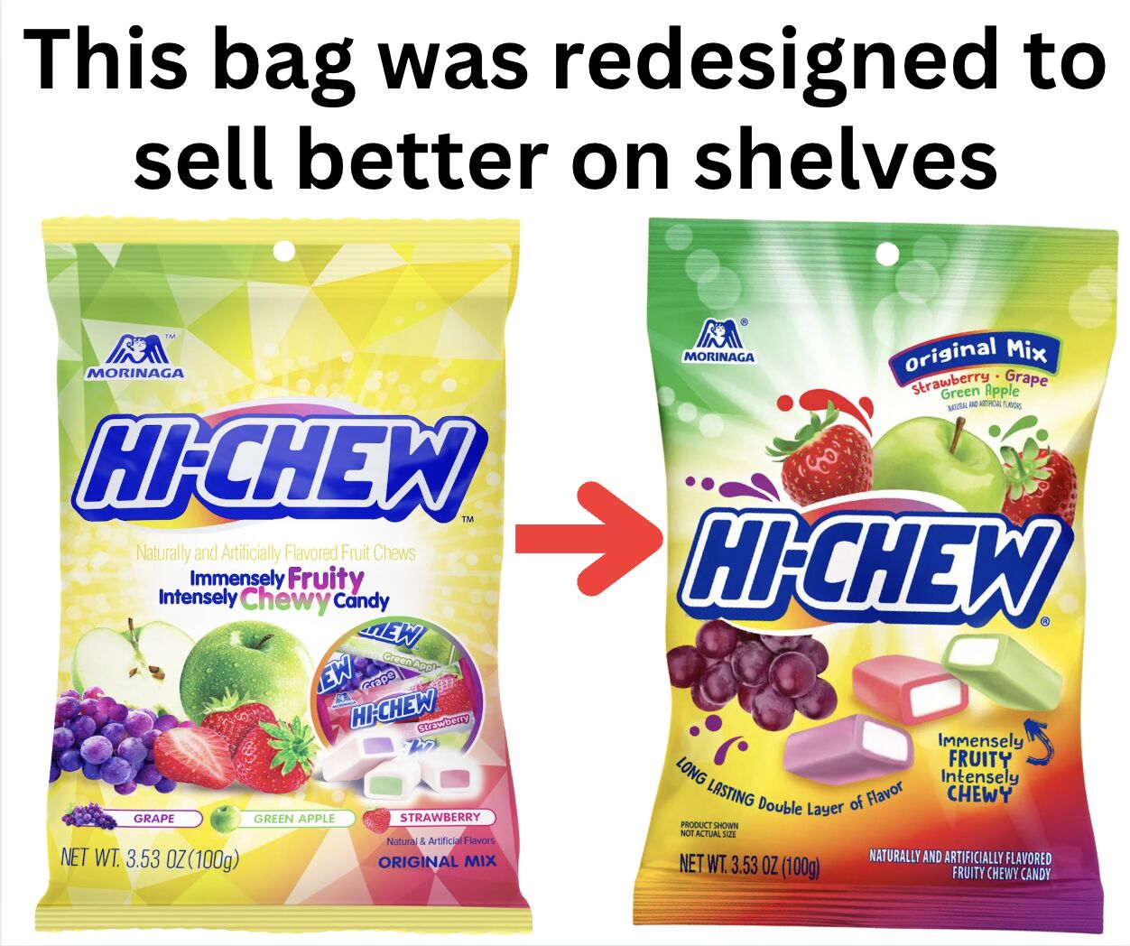
In a recent LinkedIn post, Jason Feifer discusses how strategic packaging redesigns can significantly impact a product’s retail success. Feifer, an entrepreneur and editor-in-chief of Entrepreneur magazine, highlights the case of HI-CHEW candy and its recent efforts to become more appealing and accessible to consumers in a busy retail environment.
Feifer emphasizes that product design should not be driven by internal preferences but by the needs and behaviors of the target consumer. He notes that in a fast-paced shopping setting, consumers often make decisions within a fleeting moment.
“Remember — don’t design products for yourself. Design them for a busy, fast-moving consumer who has 1 second to think.”
Analyzing HI-CHEW’s Packaging Overhaul
Feifer breaks down three key changes HI-CHEW implemented to improve its retail visibility and sales. According to Feifer, these adjustments were aimed at making the product “easier to shop” and to “grab more eyeballs” on crowded shelves.
1. Prominent Logo Placement
The first major change Feifer points out is the relocation of the HI-CHEW logo to the center of the packaging. Previously, the logo was positioned at the top, an area susceptible to being obscured by folded bags or shelf overlaps, rendering it invisible to potential buyers. Feifer explains the rationale:
“Their logo used to sit on top — where folded bags and shelf overlap can make it invisible. Now it’s front and center.”
This strategic shift ensures brand recognition is immediately apparent, a crucial factor when consumers are scanning shelves quickly.
2. Enhanced Flavor Name Readability
Feifer also highlights the enlargement of flavor names on the packaging. He argues that customers often search for specific flavors, and the previous design required consumers to strain their eyes. By making the flavor names larger and more prominent, HI-CHEW addresses this pain point directly.
3. Improved Key Quality Messaging
The third significant change, as detailed by Feifer, involves improving the clarity and impact of the product’s primary selling propositions. HI-CHEW enhanced the readability of its main ‘sell line’ and introduced a secondary quality statement. Feifer stresses the importance of clearly communicating why a consumer should choose one product over another in a competitive market.
Designing for the Consumer’s Reality
Feifer uses these examples to advocate for a consumer-centric approach to product design. He poses critical questions for businesses to consider regarding their own packaging:
- Could a stressed parent spot your product from 6 feet away?
- Would they understand what it is before their toddler grabs something else?
Feifer suggests that if the answer to these questions is no, significant packaging changes may be necessary. He frames these potential adjustments not as mere aesthetic choices, but as essential business strategies for improving market performance and driving sales in a competitive landscape.
In his post, Feifer also announced a call on November 6th focused on packaging improvements, offering advice and assistance to businesses looking to enhance their product presentation.
📝 About This Content
This article is based on insights shared by Jason Feifer on LinkedIn.
📅 Originally posted on November 4, 2025 | View original post on LinkedIn →